Wednesday, 16 December 2015

CONSTRUCTION: EDITING

Today, my group and I looked at editing and started piecing together our scenes. I created a flashback scene of The Ghost by using the lights effect in final cut pro ontop of the scene, and also having a fade to white before and after the flashback. For this I took inspiration from the trailer Taken, which had a lot of flashing lights and quick scene cuts during the trailer.
Here is a video clip of the flashing edit I did:


This is the part in the taken trailer with the flashes, that I was inspired by: 


Saturday, 12 December 2015

RESEARCH: NARRATIVE

Today I looked at David Bordwell's Understanding Film Narrative: Trailer. Which used Wolf on Wall Street as a case study.
I found this very helpful as it talks about the suspense narrative can cause, which would be useful for my action trailer.
To see the post click HERE.

The article talks about different ways of narrative including:
Dimension 1: Pushy narration
Style as narration
Narration as inference-making
Dimension 2: Plot as pattern
Caught in the act(s)
Dimension 3: The story and its world


Friday, 11 December 2015

EXAMINERS REPORT 2015

I doubled checked the examiners report of 2015, in order to check I am fulfilling everything I need to be in my film trailer.
From this I have been reminded to


  • Include the BBFC rating 
  • use a variety of shots
  • make sure my trailer is not in chronological order
  • use pace in the trailer brief 
  • clearly show the genre of the trailer.


Thursday, 10 December 2015

PLANNING: INTERROGATING CHARACTERS

Today I really looked into the character's in my trailer. I did this by interrogating them. I took the idea from the filmscape website, CLICK HERE.

I then took the character Aaron, and asked some of the questions found on the website.
I looked at the family side of the questionnaire as I thought it would be interesting as we know Aaron and Sydney live alone.
Position in family?:
Im the first born, my younger sister, Sydney is all I got really. My parents died when I was young, Syd was only a baby, maybe one. I was around five. So we lived in orphanages and foster homes until I turned 18, then I became Sydney's legal guardian and now I take care of her. 

Parents: happy? together? 
My parents were together before they died, although they weren't happy. They fought a lot. 

Relationship with siblings?
I got one sister, 17. Were very close, always have been, more so when we were younger, she goes out a lot now. 

Major love interest? 
No no, I don't have time to date, I have to take care of the house and Sydney. 

Hobbys?
I like to write, poems and books. It calms me. And I like reading.

Fears?
Loosing Sydney.


I then looked ay Sydney and had her answer some questions:

Fears? Phobias?
Not scared of anything 

Any secrets? 
That would be telling, besides, everyone has secrets. Some just don't admit to them.

Skills?
Manipulating people to get my way

Hobbies?
Going out to parties

Did your parents death affect you?
Well I don't remember it or them. So it didn't affect me personally. But I guess it affected my upbringing, never got a home, always jumping between foster parents. 

Who do you hang around with? Are they good or bad influences?
Mostly Chris, sometimes an older guy who helps me with some issues. And good or bad depends on who you ask. 


I then recorded the questions and answers as Sydney. 


Sophie then also decided to interrogate Sydney. This is how I answered her questions: 


Kate's questions were about her character, the female immigrant. 


And finally Marcus asked his questions to his character Aaron. 


Monday, 7 December 2015

RESEARCH; TRAILER TAKEN

Today I looked at the trailer Taken.

I wanted to learn from the professionals and look at how many cuts was in the trailer.
I counted, roughly 151 cuts throughout taken, although the fast paced trailer and flashes made it very hard to count.
I also counted 6 intertitles, 2 production companies and 1 MPAA

I was also very impressed with the editing style of taken, such as the negative sections, so I showed my group the trailer so we could take inspiration from it.

Friday, 4 December 2015

CONSTRUCTION: PRACTICE POSTER


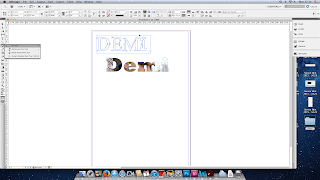
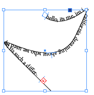
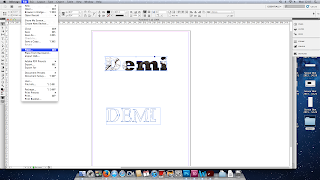
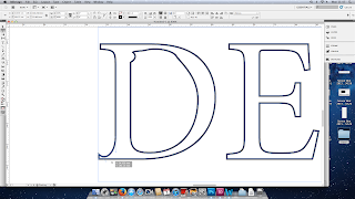
Today in class we looked at Abode InDesign and learned how to create text, add images, type in a shape, type on a path. I also figured out how to warp text to make it unique. In design was a complete new experience to me as I had never used it before. Below is some of the skills I learned:


To warp the text I created outlines and then used the white arrow to move the lines around.

I selected the pen tool to draw a line

I then selected the type on path tool

This was the outcome.

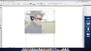
To do this on the text, I created outlines and then I went to the file tab, and then place. I then added in the picture.

 
I could then move the picture around until I was happy with the outcome.


I also had a play around with Photoshop and the different tools there, comparing InDesign to Photoshop. I found Photoshop easier, but that is just as it is more familiar with me as I know the software well.
 

Thursday, 3 December 2015

PLANNING: PRACTICE POSTER

Today in class we took some practice poster pictures, ready for out tutorial on InDesign tomorrow. Below are the practice images:


RESEARCH: FILM POSTERS

Today we looked at professional film posters in order to learn from the professionals. I looked at Inception, and created a word document with all the writing needed for my poster. Along with this I also looked at the font used for the credits on the poster. I researched the font, learning it was called 'Bee Two'. The font is a very narrow and all in capital letters.

Using Inception and posters we have in class I created this list for my film poster.


WRAP PRESENTS A BLACKLIGHT PRODUCTIONS A BENNETT FILM “A QUESTION OF IDENITY” MARCUS COULING JORDAN BLAKE DEMI COLLINS KATE BRAFORD SOPHIE JONES OMAR PARREIRA ALEX CHALLEN JOE SKYES GEMMA TIKKOO ALEX LONGWELL AND JAY COLLINS AS THE GHOST
CASTING BY SUZY PARRISS

MUSIC BY MICHEAL OMARI

COSTUME DESGINER JANE BLOOM

FILM EDITOR LEE SANDERS

PRODUCTION DESIGNER JESSICA KAWAII

DIRECTOR OF PHOTOGRAPHY NIA KALE

VISUAL EFFECTS BY LINDA WARREN

EXECUTIVE PRODUCERS JAMES O’BRIEN CHARLIE JOHNSON

PRODUCED BY JONATHAN GRANT JAY COLLINS

WRITTEN BY JORDI SKILBECK

DIRECTED BY DEE THOMPSON


AUGUST 2016  (25th) +


AVAILABLE IN DIGITAL 3D AND IMAX 3D IN SELECTED THEATRES


SLOGAN = HOW FAR WOULD YOU GO FOR SOMEONE YOU LOVE

Instagram bug: @aquestionofidentity
Facebook bug: facebook.com/aquestionofidentity
Twitter bug: @blacklightmovie

I decided we needed a slogan, which I am still working on, but this was a rough idea for one.

I also gathered transparent logos for Instagram, Facebook and Twitter for my poster, as a lot of recent posters have those on them to spread the word via social media.

Thursday, 26 November 2015

CONSTRUCTION: FILMING

Today in class, we took the opportunity to use the daylight hours and time to film the refilm graveyard scene. I filmed today's scene in the graveyard and I choose to use both the rule of thirds and the quadrant system, which I learned about from the YouTube channel 'Every Frame is a Panting' using Nicolas Winding Refn’s film Drive (2011) .
Click here to see the video


Drive (2011) - The Quadrant System from Tony Zhou on Vimeo.
Here are some images from shooting:
This collage was created using FUZEL an app on my phone.


RESEARCH: TRAILER BRIDGE OF SPIES

Today in class we looked at Bridge of Spies, the new film by Steven Spielberg, trailer. We counted roughly 120 cuts, give or take, in the trailer, the main character was in centre frame 33 times, and there was 12 inter titles, 4 production companies. We decided to do this task, in order to learn how fast paced a high end Hollywood movie is.


Watch the trailer HERE

Wednesday, 25 November 2015

RESEARCH: ANALYSING FILM MAGAZINE 3


PLANNING: LOCATION RECCE

Today my group and I did a location reccee for the graveyard scene, as we had to re-film it as the scenes Kate and Marcus shot before were out of focus and shaky. We decided to film in St Georges church.
I created this using the app fuzel


Monday, 23 November 2015

RESEARCH: ANALYSING FILM MAGAZINE 1


RESEARCH: FILM MAGAZINE

List of current film magazines in the UK
  • Electric Sheep
  • Empire
  • Film International 
  • Little White Lies
  • Screen International 
  • Sight & Sound 
  • Total Film
  • Vertigo


GLOSSARY: 


  1.  Alley: the space between columns within a page. Not to be confused with the gutter,which is the combination of the inside margins of two facing pages.
  1. Banner: The title of a periodical, which appears on the cover of the magazine and on the first page of the newsletter. It contains the name of the publication and serial information, date, volume, number. 
  1. Bleed: when the image is printed to the very edge of the page.
  1. Block quote: A long quotation - four or more lines - within body text, that is set apart in order to clearly distinguish the author’s words from the words that the author is quoting.
  1. Body or body copy: (typesetting) the main text of the work but not including headlines.
  1. Boost: picture boost (usually front page) pic promoting a feature or story in later pages
  1. Strap boost: as previous, but with a strapline, not a picture
  1. Byline: A journalists name at the beginning of a story.
  1. Callout: An explanatory label for an illustration, often drawn with a leader line pointing to a part of the illustration.
  1. Centre of visual interest (CVI) : Theprominent item on a page usually a headline, picture or graphic.
  1. Column gutter: The space between columns of type.
  1. Copy: Main text of a story.
  1. Cover lines : Information about major articles given on the front page of a magazine 
  1. Cross head: A few words used to break uplarge amounts of text, normally taken from the main text. Typically used in interviews.
  1. Cutlines: Explanatory text, usually fullsentences, that provides information aboutillustrations. Cutlines are sometimes called captions or legends.
  1. Deck: a headline is made up of decks, each set in the same style and size of type. A multi deck heading is one with several headings each different from the next and should not be confused with the number of lines a heading has. A four line heading is not the same as a four deck heading.
  1. Drop cap: a large initial letter at the start ofthe text that drops into the line or lines of text below.
  1. Feature: A longer, more in-depth article.
  1. Facing pages: In a double-sided document, the two pages that appear as a spread when the publication is opened.
  1. Flush left: copy aligned along the left margin. Flush right: copy aligned along the right margin.
  1. Golden ratio: the rule devised to giveproportions of height to width when laying out text and illustrations to produce the mostoptically pleasing result. Traditionally a ratio of 1 to 1.6.
  1. Justify: (typesetting) the alignment of text along a margin or both margins. This isachieved by adjusting the spacing between the words and characters as necessary so that each line of text finishes at the same point.
  1. Kicker: The first sentence or first few words of a storys lead, set in a font size larger than the body text of the story.
  1. Left-side third: A lot of important information designed to attract potential readers is placed in the left-hand side vertical third of the front cover page. This is in case the magazine is displayed in a horizontal shelving system rather than a vertical one.
  1. Masthead: Magazine term referring to theprinted list, usually on the editorial page of a newspaper or magazine, that lists the contributors. Typically this would include the owners, publishers, editors, designers and production team. The masthead is often mistakenly used in reference to the flag or nameplate, which actually refers to the designed logo of the publication.
  1. Negative space: (or white space) the area of page without text, image or other elements
  1. Noise: A noisy image or noisy scan is one where there are random or extra pixels that have degraded the image quality. Noise in a graphics image can be generated at the scanning stage, by artificially enlarging an image by interpolating the pixels, or by over- sharpening a digital photograph. Noise can sometimes also be found in photographs taken by some cheaper digital cameras.
  1. Overline: introductory headline in smaller text size above the main headline
  1. Plug: Information about the contents of a magazine or newspaper given on the front cover     
  1. Puff: Words or phrases on the cover of a magazine used to boost status
  1. Pull quote: A brief phrase (not necessarily an actual quotation) from the body text, enlarged and set off from the text with rules, a box, and/or a screen. It is from a part of the text set previously, and is set in themiddle of a paragraph, to add emphasis and interest. A quote or exerpt from an article that is used as displaytext on the same page to entice the reader, highlight a topic or break up linearity.
  1. Recto: Right-hand page.
  1. Rivers: A river is a typographic term for the ugly white gaps that can occur in justified columns oftype, when there is too much space between words on concurrent lines of text. Rivers are especiallycommon in narrow columns of text, where the type size is relatively large. Rivers are best avoided by either setting the type as ragged, increasing the width of the columns, decreasing the point size of the text, or by using a condensed typeface. An often overlooked method of avoiding rivers, is thecareful use of hyphenation and justification settings in page layout programs such as QuarkXpress or InDesign.
  1. Running head: A title or heading that runsalong the top of a printed publication, usually a magazine.
  1. Sell: Short sentence promoting an article, often pulling out a quote or a interesting sentence.
  1. Splash: Main front page story.
  1. Standfirst: will usually be written by the sub-editor and is normally around 40-50 words in length. Any longer and it defeats its purpose, any shorter and it becomes difficult to get the necessary information in. Its purpose is to give some background information about the writer of the article, or to give some context to the contents of the article. Usually, it is presented in typesize larger than the story text, but much smaller than the headline.
  1. Strapline: Similar to a subhead or standfirst, but used more as a marketing term.
  1. Talkie headline: a quote from one of the people in the story used as a headline
  1. Tag line: a short memorable line of cover text that sums up the tone of the publication (Loaded Mag has :For men who should know better)
  1. Tombstoning: In page layout, to put articlesside by side so that the headlines are adjacent. The phenomenon is also referred to as bumping heads.
  1. Top heads: Headlines at the top of a column.
  1. Widow: Last line of paragraph appearing on the first line of a column of text.
  1. Wob: White text on a black or other coloured background.


I then started looking at film magazine covers and noticed that they all have a space between the edge of the magazine and where the text ends. This is to insure no text gets cut off during the printing process.They all tend to have a large and bold font in a block colour, taking up the top section of the magazine cover. They also have puff's and pull quotes at the side in order to lure the reader in. 

Sunday, 22 November 2015

RESEARCH: ANALYSING FILM POSTER 4


Colour scheme
The colour scheme for the Silence of the Lambs poster focuses mainly on blue and red tones. Running down from the right side of the poster, along the cheekbone and to the neck is a blue tone. This adds a grainy look to the poster and really emphasises the blue.  The other colour evident in the poster is red; the girls eyes are red, along with the moth’s wings and the title of the film. (explain red and blah blah danger)

Position of text and image
All of the text is towards the bottom of the poster, the image covers the majority of the poster, as it is iconic and eye catching.  The top bit of text is the names of people featured in the film; Jodie Foster, Anthony Hopkins, Scott Glenn. Under this we see the title of the film, followed “from the terrifying best seller”, and after that the institutional information.

Film title design
The title of the film The Silence of the Lambs is featured in red and is the largest text seen on the page. The title of the film does not take up that much room, as the key aspect of this poster is the image of the girl, however to still draw the eye to the text, it is placed in the same colour as both the eyes of the girl in the poster, and the top set of wings on the moth feature the colour red. Another thing that makes the title stand out is it is the only coloured text on the poster. The rest of the text is white or grey.

Institutional information
This is found at the bottom of the poster and says a jonathan demme picture, it then features the names of the three actors who star in the movie. Jodie Foster, Anthony Hopkins, Scott Glenn, it then says the title of the film, and then says another actors name, Ted Levine. Then it states who did the music, who was the production designer, the director of photography, the editor, the executive producer, the author who wrote the novel the film was based upon, the screenplay writer, and the producer and director.

Characters & Iconography
The moth featured on the girls lips is iconic, the skull on the moth is the skull made up of 7 naked women, which was created by surrealist artist Salvador Dali. The moth and its cousin butterfly are extremely symbolic to The Silence of the Lambs.

Genre

The colour scheme and eeriness of the photo in the poster is what leads the genre to horror. The colour scheme being dark colours, with blacks and blues and then featuring red, which is the colour of blood and represents danger. The skull on the moth also gives away the horror aspect of the film, as it shows a direct link to death.